Question 6 of 40

HOTSPOT -

Case Study -

This is a case study. Case studies are not limited separately. You can use as much exam time as you would like to complete each case. However, there may be additional case studies and sections on this exam. You must manage your time to ensure that you are able to complete all questions included on this exam in the time provided.

To answer the questions included in a case study, you will need to reference information that is provided in the case study. Case studies might contain exhibits and other resources that provide more information about the scenario that is described in the case study. Each question is independent of the other question on this case study.

At the end of this case study, a review screen will appear. This screen allows you to review your answers and to make changes before you move to the next sections of the exam. After you begin a new section, you cannot return to this section.

To start the case study -

To display the first question on this case study, click the Next button. Use the buttons in the left pane to explore the content of the case study before you answer the questions. Clicking these buttons displays information such as business requirements, existing environment, and problem statements. If the case study has an

All Information tab, note that the information displayed is identical to the information displayed on the subsequent tabs. When you are ready to answer a question, click the Question button to return to the question.

Background -

You are developing an application named Timeline that presents information on a timeline. The app allows users to create items and enter details about the item.

The app displays item names on a timeline. When users select an item name on the timeline, the app displays additional content about the item.

Business requirements -

Timeline section -

The timeline element of the app has the following layout requirements:

The timeline must adapt to the screen size and orientation of the device.

The timeline size must dynamically change if the window containing the content is resized by the user.

The user must be able to scroll through the timeline horizontally when the device is in landscape mode.

The user must be able to scroll through the timeline vertically when the device is in portrait mode.

The timeline must begin scrolling as soon as a scroll is detected. Scrolling must continue for a short distance after the scroll input has stopped.

Scroll bars or panning controls must always be visible.

The following image depicts the layout for the timeline section of the app when the device is using landscape orientation:

The following image depicts the layout for the timeline section of the app when the device is using portrait orientation:

Content section -

The content element of the app has the following layout requirements:

When a user selects an item on the timeline, the details for that item must display beneath or to the right of the timeline.

The content section must display one page of information. The element must be a child of the selected item in the timeline.

Users must be able to return to a previously selected event by pressing the Back button.

User interface -

The user must be able to navigate the application using the interface below:

The Favorite button marks the current content to be displayed in a Favorites panel.

The Back and Forward buttons navigate through the app selection history. Both buttons must be available on all devices.

The Notes button allows the user to manage notes about the current content.

The app must support touch, mouse, and stylus input.

The app layout must automatically adapt to the screen size and orientation.

Technical requirements -

Layout -

You identify the following layout requirements:

General -

All user interface (UI) elements must continuously scale when a user resizes the window.

UI controls must be smaller and spaced closer together if there is a mouse or stylus available.

UI controls must be larger and spaced farther apart if the device supports touch and there is no mouse or pointer available.

Timeline -

The timeline must be displayed in a horizontal layout when the device is in a landscape orientation or when the horizontal width is greater than the vertical

height.

The timeline must be displayed in a vertical layout when the device is in a portrait orientation or when the vertical height is greater than the horizontal width.

Each item in the past must be linked to the next item in the future.

Users must be able to scroll from past events to future events or from future events to past events.

The app must only allow one level of detail to be linked to each item in the timeline.

Optimization -

You must optimize the app using the following guidelines:

You must minimize the time it takes to display content when an item on the timeline is selected.

The app must respect memory and resource constraints for all devices.

XAML coding style -

All code and markup must conform to the following style guidelines:

Use resource dictionaries for styles that are used more than once.

Limit the use of nested panels.

Use built-in properties of existing panels instead of using separate style objects.

Use the navigation structure that best models the data without exceeding the requirements of the app.

Application structure -

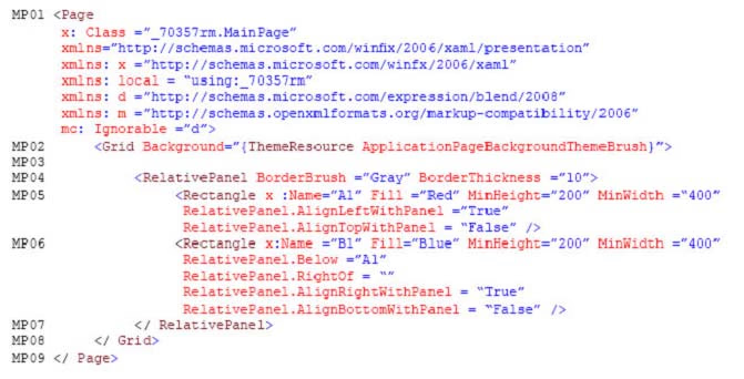
MainPage.xaml -

Relevant portions of the app files are shown below. (Line numbers in the code segments are included for reference only and include a two-character prefix that denotes the specific file to which they belong.)

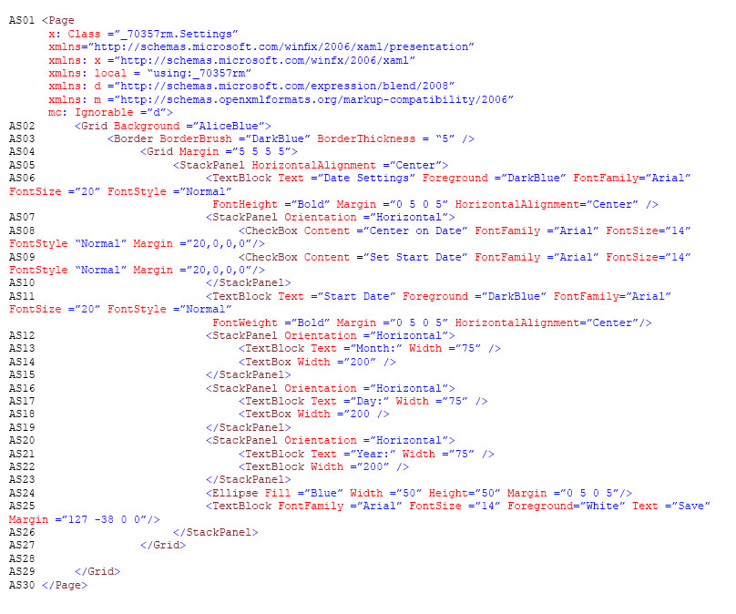
Settings.xaml -

Relevant portions of the app files are shown below. (Line numbers in the code segments are included for reference only and include a two-character prefix that denotes the specific file to which they belong.)

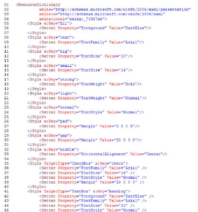
ResourceDictionery.xaml -

Relevant portions of the app files are shown below. (Line numbers in the code segments are included for reference only.)
MainPage.xaml.cs -

Relevant portions of the app files are shown below. (Line numbers in the code segments are included for reference only and include a two-character prefix that denotes the specific file to which they belong.)

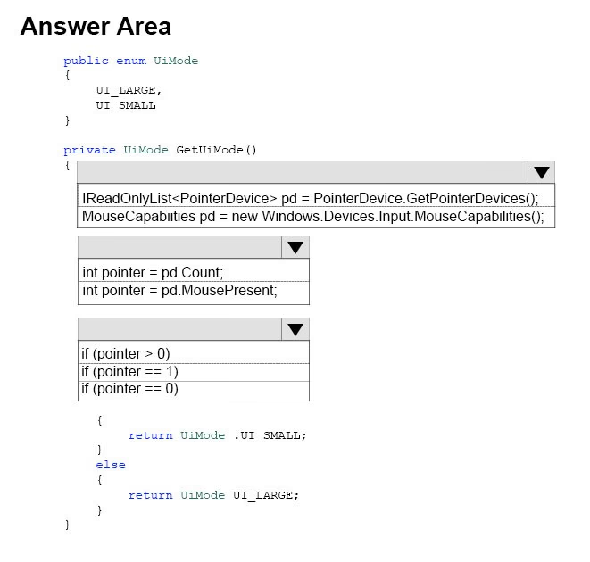
You need to properly handle the size of the user interface objects.

How should you complete the method? To answer, select the appropriate code segment from each list in the answer area.

NOTE: Each correct selection is worth one point.

Hot Area:
    Correct Answer:

    From scenario:

    UI controls must be smaller and spaced closer together if there is a mouse or stylus available.

    UI controls must be larger and spaced farther apart if the device supports touch and there is no mouse or pointer available.

    Box 1: MouseCapabilities pd = new Windows.Devices.Input.MouseCapabilities();

    The Windows.Devices.Input namespace contains the MouseCapabilities class used to retrieve the properties exposed by one or more connected mice. Just create a new MouseCapabilities object and get the properties you're interested in.

    Box 2: int pointer = pd.MousePresent;

    Example:

    MouseCapabilities mouseCapabilities = new Windows.Devices.Input.MouseCapabilities();

    MousePresent.Text = mouseCapabilities.MousePresent != 0 ? "Yes" : "No";

    Box 3: if (pointer == 1)

    This is true if a mouse is present.

    Reference: https://docs.microsoft.com/en-us/windows/uwp/input-and-devices/identify-input-devices

Question 7 of 40

HOTSPOT -

Case Study -

This is a case study. Case studies are not limited separately. You can use as much exam time as you would like to complete each case. However, there may be additional case studies and sections on this exam. You must manage your time to ensure that you are able to complete all questions included on this exam in the time provided.

To answer the questions included in a case study, you will need to reference information that is provided in the case study. Case studies might contain exhibits and other resources that provide more information about the scenario that is described in the case study. Each question is independent of the other question on this case study.

At the end of this case study, a review screen will appear. This screen allows you to review your answers and to make changes before you move to the next sections of the exam. After you begin a new section, you cannot return to this section.

To start the case study -

To display the first question on this case study, click the Next button. Use the buttons in the left pane to explore the content of the case study before you answer the questions. Clicking these buttons displays information such as business requirements, existing environment, and problem statements. If the case study has an

All Information tab, note that the information displayed is identical to the information displayed on the subsequent tabs. When you are ready to answer a question, click the Question button to return to the question.

Background -

You are developing an application named Timeline that presents information on a timeline. The app allows users to create items and enter details about the item.

The app displays item names on a timeline. When users select an item name on the timeline, the app displays additional content about the item.

Business requirements -

Timeline section -

The timeline element of the app has the following layout requirements:

The timeline must adapt to the screen size and orientation of the device.

The timeline size must dynamically change if the window containing the content is resized by the user.

The user must be able to scroll through the timeline horizontally when the device is in landscape mode.

The user must be able to scroll through the timeline vertically when the device is in portrait mode.

The timeline must begin scrolling as soon as a scroll is detected. Scrolling must continue for a short distance after the scroll input has stopped.

Scroll bars or panning controls must always be visible.

The following image depicts the layout for the timeline section of the app when the device is using landscape orientation:

The following image depicts the layout for the timeline section of the app when the device is using portrait orientation:

Content section -

The content element of the app has the following layout requirements:

When a user selects an item on the timeline, the details for that item must display beneath or to the right of the timeline.

The content section must display one page of information. The element must be a child of the selected item in the timeline.

Users must be able to return to a previously selected event by pressing the Back button.

User interface -

The user must be able to navigate the application using the interface below:

The Favorite button marks the current content to be displayed in a Favorites panel.

The Back and Forward buttons navigate through the app selection history. Both buttons must be available on all devices.

The Notes button allows the user to manage notes about the current content.

The app must support touch, mouse, and stylus input.

The app layout must automatically adapt to the screen size and orientation.

Technical requirements -

Layout -

You identify the following layout requirements:

General -

All user interface (UI) elements must continuously scale when a user resizes the window.

UI controls must be smaller and spaced closer together if there is a mouse or stylus available.

UI controls must be larger and spaced farther apart if the device supports touch and there is no mouse or pointer available.

Timeline -

The timeline must be displayed in a horizontal layout when the device is in a landscape orientation or when the horizontal width is greater than the vertical

height.

The timeline must be displayed in a vertical layout when the device is in a portrait orientation or when the vertical height is greater than the horizontal width.

Each item in the past must be linked to the next item in the future.

Users must be able to scroll from past events to future events or from future events to past events.

The app must only allow one level of detail to be linked to each item in the timeline.

Optimization -

You must optimize the app using the following guidelines:

You must minimize the time it takes to display content when an item on the timeline is selected.

The app must respect memory and resource constraints for all devices.

XAML coding style -

All code and markup must conform to the following style guidelines:

Use resource dictionaries for styles that are used more than once.

Limit the use of nested panels.

Use built-in properties of existing panels instead of using separate style objects.

Use the navigation structure that best models the data without exceeding the requirements of the app.

Application structure -

MainPage.xaml -

Relevant portions of the app files are shown below. (Line numbers in the code segments are included for reference only and include a two-character prefix that denotes the specific file to which they belong.)

Settings.xaml -

Relevant portions of the app files are shown below. (Line numbers in the code segments are included for reference only and include a two-character prefix that denotes the specific file to which they belong.)

ResourceDictionery.xaml -

Relevant portions of the app files are shown below. (Line numbers in the code segments are included for reference only.)

MainPage.xaml.cs -

Relevant portions of the app files are shown below. (Line numbers in the code segments are included for reference only and include a two-character prefix that denotes the specific file to which they belong.)

You are reviewing the App_BackRequested method in the MainPage.xaml.cs file.

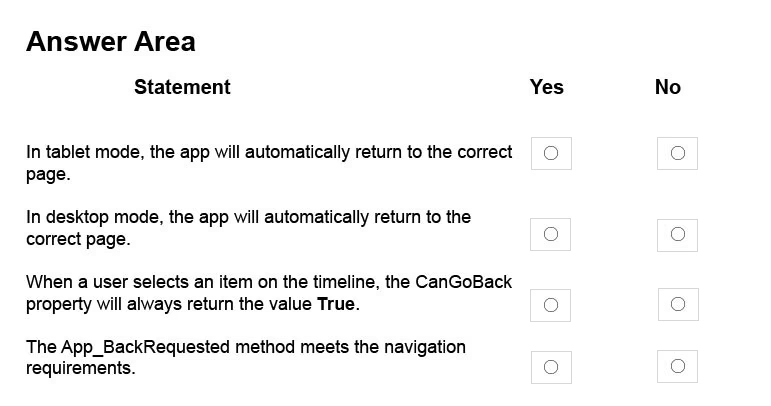
For each of the following statements, select Yes if the statement is true. Otherwise, select No.

NOTE: Each correct selection is worth one point.

Hot Area:
    Correct Answer:

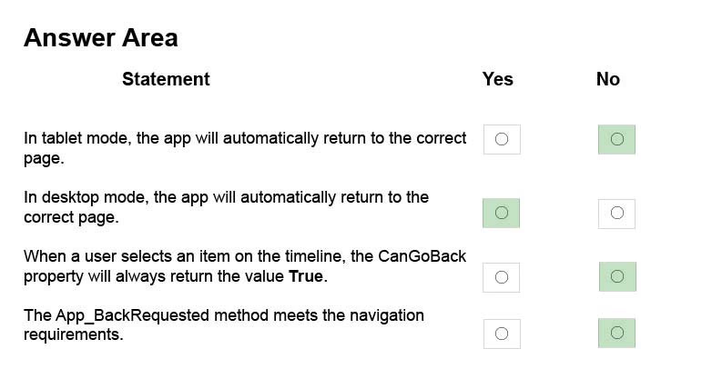
    Box 1: No -

    If we assume that the client is a PC, then the back button is not available in tablet mode.

    Box 2: Yes -

    If we assume that the client is a PC, then the back button is available in desktop mode.

    Box 3: No -

    The user cannot go back from the first item on the timeline.

    Box 4: No -

    From scenario: The Back and Forward buttons navigate through the app selection history. Both buttons must be available on all devices.

    Reference: https://docs.microsoft.com/en-us/windows/uwp/layout/navigation-history-and-backwards-navigation

Question 8 of 40

Case Study -

This is a case study. Case studies are not limited separately. You can use as much exam time as you would like to complete each case. However, there may be additional case studies and sections on this exam. You must manage your time to ensure that you are able to complete all questions included on this exam in the time provided.

To answer the questions included in a case study, you will need to reference information that is provided in the case study. Case studies might contain exhibits and other resources that provide more information about the scenario that is described in the case study. Each question is independent of the other question on this case study.

At the end of this case study, a review screen will appear. This screen allows you to review your answers and to make changes before you move to the next sections of the exam. After you begin a new section, you cannot return to this section.

To start the case study -

To display the first question on this case study, click the Next button. Use the buttons in the left pane to explore the content of the case study before you answer the questions. Clicking these buttons displays information such as business requirements, existing environment, and problem statements. If the case study has an

All Information tab, note that the information displayed is identical to the information displayed on the subsequent tabs. When you are ready to answer a question, click the Question button to return to the question.

Background -

You are developing an application named Timeline that presents information on a timeline. The app allows users to create items and enter details about the item.

The app displays item names on a timeline. When users select an item name on the timeline, the app displays additional content about the item.

Business requirements -

Timeline section -

The timeline element of the app has the following layout requirements:

The timeline must adapt to the screen size and orientation of the device.

The timeline size must dynamically change if the window containing the content is resized by the user.

The user must be able to scroll through the timeline horizontally when the device is in landscape mode.

The user must be able to scroll through the timeline vertically when the device is in portrait mode.

The timeline must begin scrolling as soon as a scroll is detected. Scrolling must continue for a short distance after the scroll input has stopped.

Scroll bars or panning controls must always be visible.

The following image depicts the layout for the timeline section of the app when the device is using landscape orientation:

The following image depicts the layout for the timeline section of the app when the device is using portrait orientation:

Content section -

The content element of the app has the following layout requirements:

When a user selects an item on the timeline, the details for that item must display beneath or to the right of the timeline.

The content section must display one page of information. The element must be a child of the selected item in the timeline.

Users must be able to return to a previously selected event by pressing the Back button.

User interface -

The user must be able to navigate the application using the interface below:

The Favorite button marks the current content to be displayed in a Favorites panel.

The Back and Forward buttons navigate through the app selection history. Both buttons must be available on all devices.

The Notes button allows the user to manage notes about the current content.

The app must support touch, mouse, and stylus input.

The app layout must automatically adapt to the screen size and orientation.

Technical requirements -

Layout -

You identify the following layout requirements:

General -

All user interface (UI) elements must continuously scale when a user resizes the window.

UI controls must be smaller and spaced closer together if there is a mouse or stylus available.

UI controls must be larger and spaced farther apart if the device supports touch and there is no mouse or pointer available.

Timeline -

The timeline must be displayed in a horizontal layout when the device is in a landscape orientation or when the horizontal width is greater than the vertical

height.

The timeline must be displayed in a vertical layout when the device is in a portrait orientation or when the vertical height is greater than the horizontal width.

Each item in the past must be linked to the next item in the future.

Users must be able to scroll from past events to future events or from future events to past events.

The app must only allow one level of detail to be linked to each item in the timeline.

Optimization -

You must optimize the app using the following guidelines:

You must minimize the time it takes to display content when an item on the timeline is selected.

The app must respect memory and resource constraints for all devices.

XAML coding style -

All code and markup must conform to the following style guidelines:

Use resource dictionaries for styles that are used more than once.

Limit the use of nested panels.

Use built-in properties of existing panels instead of using separate style objects.

Use the navigation structure that best models the data without exceeding the requirements of the app.

Application structure -

MainPage.xaml -

Relevant portions of the app files are shown below. (Line numbers in the code segments are included for reference only and include a two-character prefix that denotes the specific file to which they belong.)

Settings.xaml -

Relevant portions of the app files are shown below. (Line numbers in the code segments are included for reference only and include a two-character prefix that denotes the specific file to which they belong.)

ResourceDictionery.xaml -

Relevant portions of the app files are shown below. (Line numbers in the code segments are included for reference only.)

MainPage.xaml.cs -

Relevant portions of the app files are shown below. (Line numbers in the code segments are included for reference only and include a two-character prefix that denotes the specific file to which they belong.)

You need to configure the app to meet the load time requirements.

What should you do?

    Correct Answer:

    Explanation

    Scenario: You must optimize the app using the following guidelines:

    You must minimize the time it takes to display content when an item on the timeline is selected.

    The app must respect memory and resource constraints for all devices.

    You use the NavigationCacheMode property to specify whether a new instance of the page is created for each visit to the page or if a previously constructed instance of the page that has been saved in the cache is used for each visit.

    The default value for the NavigationCacheMode property is Disabled. Set the NavigationCacheMode property to Enabled or Required when a new instance of the page is not essential for each visit. By using a cached instance of the page, you can improve the performance of your application and reduce the load on your server.

    Reference: https://msdn.microsoft.com/en-us/library/system.windows.controls.page.navigationcachemode(v=vs.95).aspx

Question 9 of 40

Note: This question is part of a series of questions that present the same scenario. Each question in the series contains a unique solution. Determine whether the solution meets the stated goals.

You are developing a Universal Windows Platform (UWP) app.

Your app stores files on a users device.

You need to be able to replace the existing files with new files generated by the user.

Solution: You run the StorageFile.OpenSequentialReadAsync method to replace the existing file.

Does this meet the goal?

    Correct Answer:

    The StorageFile.OpenSequentialReadAsync method is used to open a sequential-access stream for reading the contents of a file. It does not provide functionality to modify or replace an existing file with new content. To replace an existing file, you should use methods that allow writing or overwriting, such as StorageFile.CreateFileAsync, StorageFile.ReplaceWithStreamedFileAsync, or StorageFile.CopyAndReplaceAsync. Therefore, the proposed solution does not meet the stated goal of replacing existing files with new files generated by the user.

Question 10 of 40

Note: This question is part of a series of questions that present the same scenario. Each question in the series contains a unique solution. Determine whether the solution meets the stated goals.

You are developing a Universal Windows Platform (UWP) app.

Your app stores files on a users device.

You need to be able to replace the existing files with new files generated by the user.

Solution: You run the StorageFile.GetParentAsync method to get a reference to the existing file. Then, you run the StorageFile.CreateStreamedFileAsync method to create the new file at the same location.

Does this meet the goal?

    Correct Answer:

    The given solution does not meet the goal. The StorageFile.GetParentAsync method does indeed get the parent folder of the current file, and not a direct reference to the file itself. The StorageFile.CreateStreamedFileAsync method creates a new file but does not replace the existing file. Therefore, to replace the existing files with new files, one should ideally delete the existing file and then create the new file in its place using appropriate methods. The proposed solution does not correctly align with the stated goal of replacing existing files with new files.