PL-300 Exam QuestionsBrowse all questions from this exam

PL-300 Exam - Question 258


You have a Power BI semantic model named Model1 that contains two fields named Sales and Quarter. Model1 contains a DAX measure that sums the Sales column.

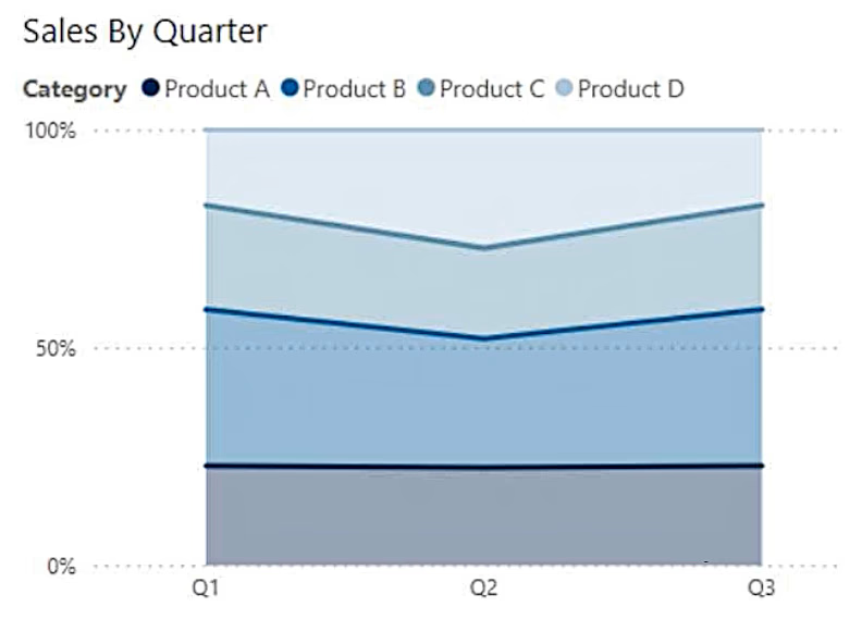
You need to create a report that will contain the visual shown in the following exhibit.
Exam PL-300 Question 258

The solution must NOT require additional DAX measures.

Which type of visual should you use?

Show Answer
Correct Answer:

Discussion

5 comments
Sign in to comment
0e11c58Option: C
Jan 13, 2025

Checked google

be79ac3Option: C
Apr 20, 2025

100% stacked as it is showing different segments in a 100% total

namuuuOption: B
Jan 16, 2025

The report requires a visual that shows how Sales changes over time (by quarter). A line chart is the most appropriate choice because: Purpose of a Line Chart: A line chart is ideal for visualizing trends and patterns over a continuous dimension, such as time (Quarter in this case). It displays the progression of values (e.g., Sales) across sequential periods. No Additional DAX Measures Required: Since the DAX measure already sums the Sales column, the line chart can directly use the measure for plotting the aggregated sales values against the Quarter field.

OdidepseOption: C
Jan 23, 2025

B does not show referring to the visual diagram where you have different product category stacked up, question outlines 'You need to create a report that will contain the visual shown in the following exhibit.', that is clearly menat for 100% stacked area chart. Cannot be B line chart as per the exhibited visual shown which is stacked category..

SylUKOption: C
Feb 13, 2025

C is the answer 100% stacked area chart: A 100% stacked area chart shows how the constituent parts of a whole have changed over time. The y axis scale is always 100%. Each area of colour represents one part of the whole. The parts are stacked up, usually vertically. (Found in Google)