Exam PL-300 All QuestionsBrowse all questions from this exam
Question 155

HOTSPOT -

You have the Power BI dashboard shown in the Dashboard exhibit. (Click the Dashboard tab.)
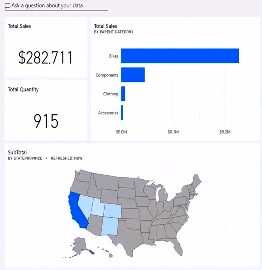
You need to ensure that when users view the dashboard on a mobile device, the dashboard appears as shown in the Mobile exhibit. (Click the Mobile tab.)
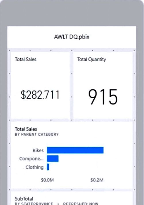
What should you do? To answer, select the appropriate options in the answer area.

NOTE: Each correct selection is worth one point.

Hot Area:
    Correct Answer:

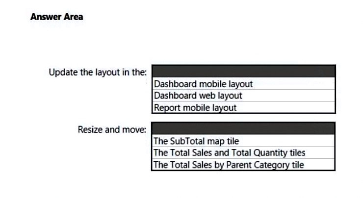
    Box 1: Report mobile layout -

    Power BI provides a number of features to help you create mobile-optimized versions of your reports:

    * A mobile layout view where you create your mobile-optimized report by dragging and dropping visuals onto a phone emulator canvas.

    * Etc.

    Box 2: The Total Sales by Parent Category tile

    Reference:

    https://docs.microsoft.com/en-us/power-bi/create-reports/power-bi-create-mobile-optimized-report-about

Discussion
Manikom

From PowerBI service: - Update Dashboard Mobile Layout - Resize and move total sales and total quantity Dashboard mobile feature already fits the tiles in the view, and when recreating same scenario you only need to work on the 2 cards If you use Report Mobile View feature from PowerBI desktop, you will have an empty canvas and will need to work on all tiles

j0gam0d

Dashboard mobile layout Total Sales and Total Quantity

SuniltheMentor

- Update Dashboard Mobile Layout - Resize and move total sales and total quantity When we drag a tile to the Mobile Layout it uses the full width, therefore we need to resize the Total Sales and Total Quantity tiles.

SanaCanada

Given Answer is correct No confusion to discuss further

Vras

you are so annoying

princie

I tried this just now, the dashboard mobile layout automatically added all the tiles from top down. I resized both cards to get the visual displayed in the exhibit.

lukelin08

- Update Dashboard Mobile Layout - Resize and move total sales and total quantity

Booster21

Why not the Total Sales by Parent Category tile, Lukelin08?

Booster21

I tested it, with dashboard mobile layout, all the tiles are already there with the same size from top down, and then only Total Sales and Total Quantity cards need to be resized,make them smaller to fit as the displayed in the question.

LeeTheRed

This question was on the exam today 9/12/2023

8b24250

these 250 questions enough to clear the exam or not .

princie

I will choose update the dashboard mobile layout and resize both sales and quantity cards based on the fact that when I tried in in PBI service that gave me the resulting the picture but with the report mobile service I had a mobile canvas and had to resize all visuals to look like the picture in the question

shakes103

Box 1: Update Dashboard Mobile Layout *The question was referring to Power BI dashboard and not report.* Box 2: The Total Sales by Parent Category tile Card visuals don't require adjustments here but other visuals do. See live example below: https://learn.microsoft.com/en-us/power-bi/create-reports/power-bi-create-mobile-optimized-report-initial-layout#lay-out-visuals-on-the-canvas

Booster21

This is report mobile layout!

BryanVicente1807

- Report Mobile Layout - Resize and move total sales and total quantity Dashboard mobile layout will change as a whole report note per tile _

cs3122

for your first answer, I think it should be Dashboard Mobile Layout, because the question is specifically talking about Dashboards, not Reports.

louisaok

dashboard vs report in Mobile https://learn.microsoft.com/en-us/power-bi/consumer/mobile/mobile-apps-quickstart-view-dashboard-report

luisnc

I have read this, and it says: "Power BI dashboards look a little different on your mobile device than they do on the Power BI service. All the tiles appear the same width, and they're arranged one after another from top to bottom"

YokoSumiGaeshi

I would say - Update Dashboard Layout - The Total Sales by Parent Category tile, because the cards are already in the proper tab order.

Smyrol

I believe this shoukd be: - Update Dashboard Mobile Layout - Resize and move total sales BECAUSE: --Total quantity card needs to be next to the Total sales card and needs to be the same height and width as the Total sales card (3 dots by 3 dots) - so this ONLY needs to be moved -- Subtotal map is to wide (needs to be 6 dots - twice the width of the Total sales card) - so it only needs to be resized. NOW: Total sales by parent category - it has the width of two cards already BUT in the original picture it shows 4 bars - in the final one it has to show only 3 - therefore, it needs to be moved (below the card) and resized (height). Thank you, good night :)

d5b48ff

Answer is IN CORRECT. I believe it should be: Update Dashboard Mobile Layout & Resize and move total sales and total quantity

JudT

In my opinion it's: * Dashboard mobile layout * Total Sales and Total Quantity As we need to put them side by side. The rest of tiles will fit automatically

SomeAzureGuyincube

It also miss some requirements which ask to have only number and KPI on the mobile view.

DANIEL

From powerbi.com, select dashboard > Edit > Mobile layout When you look at the proportions of the dashboard in web layout: 2 cards tiles equal width of Total Sales Subtotal by Province = 2x width of Total Sales When switching to web layout, cards and Total sales fits perfectly. Conclusion : You need to resize Subtotal by State Province to the same width of Total Sales

disndat7

For Box 2: Why not the SubTotal Map size? It hasn't been displayed appropriately from the mobile layout.